Let’s start with the official docs
The official documentation about drag swipe and fling can be found here: Drag, swipe, and fling. However, when you write the code you realize it’s deprecated due to a newer more flexible API that lives in the Compose Foundation layer instead of being only available through Compose Material. Google have provided an article detailing how to migrate from the old APIs to the new ones available here: Migrate from Swipeable to AnchoredDraggable. In this article however, we will use directly the new APIs to build our swipe to dismiss.
So let’s swipe
If you don’t feel like reading through the whole post and just want to get the code, you can find it in this repo: Swipe to dismiss. If you want the step by step treatment, follow the next sections. What we will build is a Composable that can be swiped horizontally left or right, fades out while moving towards the final left or right position and is removed from the composition when it reaches those positions.
First we need to define some anchors
First thing we need is to define the position anchors, which define a map of typed points that correspond to some offset value we will apply to the component to move it around. This is how it looks like:
private enum class HorizontalSwipeAnchor {
    LEFT,
    RIGHT,
    CENTER
}

val swipeDistanceDp = 160.dp
val swipeDistancePx = with(LocalDensity.current) { swipeDistanceDp.toPx() }
val anchors = remember {
    DraggableAnchors {
        HorizontalSwipeAnchor.CENTER at 0f
        HorizontalSwipeAnchor.LEFT at swipeDistancePx.unaryMinus()
        HorizontalSwipeAnchor.RIGHT at swipeDistancePx
    }
}
DraggableAnchors has a map like builder where the keys in the map are the anchors and can be of any type. You aren’t forced to create an enum for them - they can be numbers, strings, whatever works for you. The values in that map are the offset values in pixels that correspond to those anchors. Pay attention to the infix function at, which is a special DSL for that API. I’ve mentioned this API feels like a map, but there’s more to it internally, which we won’t dive into right now.
You might notice the hard coded value of swipeDistanceDp. This article uses a static value for simplicity, but there is a way to make this dynamic based on layout changes. The next section will cover how to do that.
Set up an AnchoredDraggableState
Let’s dive straight into the code:
val swipeToDismissThreshold = 0.3f
val swipeVelocityPx = with(LocalDensity.current) { swipeDistanceDp.toPx() }
val anchorState = remember {
        AnchoredDraggableState(
            initialValue = HorizontalSwipeAnchor.CENTER,
            anchors = anchors,
            positionalThreshold = { totalDistance -> totalDistance * swipeToDismissThreshold },
            velocityThreshold = { swipeVelocityPx },
            animationSpec = tween()
        )
    }
AnchoredDraggableState is the mutable state we will observe for the current offset value as well as the current typed anchor. The anchors can be passed to its constructor or updated through AnchoredDraggableState#updateAnchors. Passing the anchors to AnchoredDraggableState’s constructor initializes the offset immediately. So if you’re in the situation where you need to dynamically calculate the anchors based on layout, you call the constructor without the anchors first and then call the updateAnchors method once you have them. Until you do this, the offset value will be NaN. In this article and the sample code we go for simplicity and work with static values, thus passing the anchors to the constructor.
The positionalThreshold parameter to my understanding is the threshold after which the swipe will animate to next matching anchor even if you let it go and don’t perform the complete swipe distance.
The velocityThreshold parameter to my understanding is the speed threshold of a fling. If you fling faster than that, the swipe will animate to next matching anchor even if you didn’t reach the positionalThreshold while flinging. In the complete code in the repo I use the same value I calculate for the swipeDistancePx, but you can play with that.
Add the anchoredDraggable and offset modifiers
To wrap up the MVP, we can put everything together by using the anchoredDraggable and the offset modifiers like this:
Column(
    modifier = Modifier
        .offset {
            IntOffset(anchorState.offset.roundToInt(), 0)
        }
        .anchoredDraggable(
            state = anchorState,
            orientation = Orientation.Horizontal,
        )
) {
    ...
}
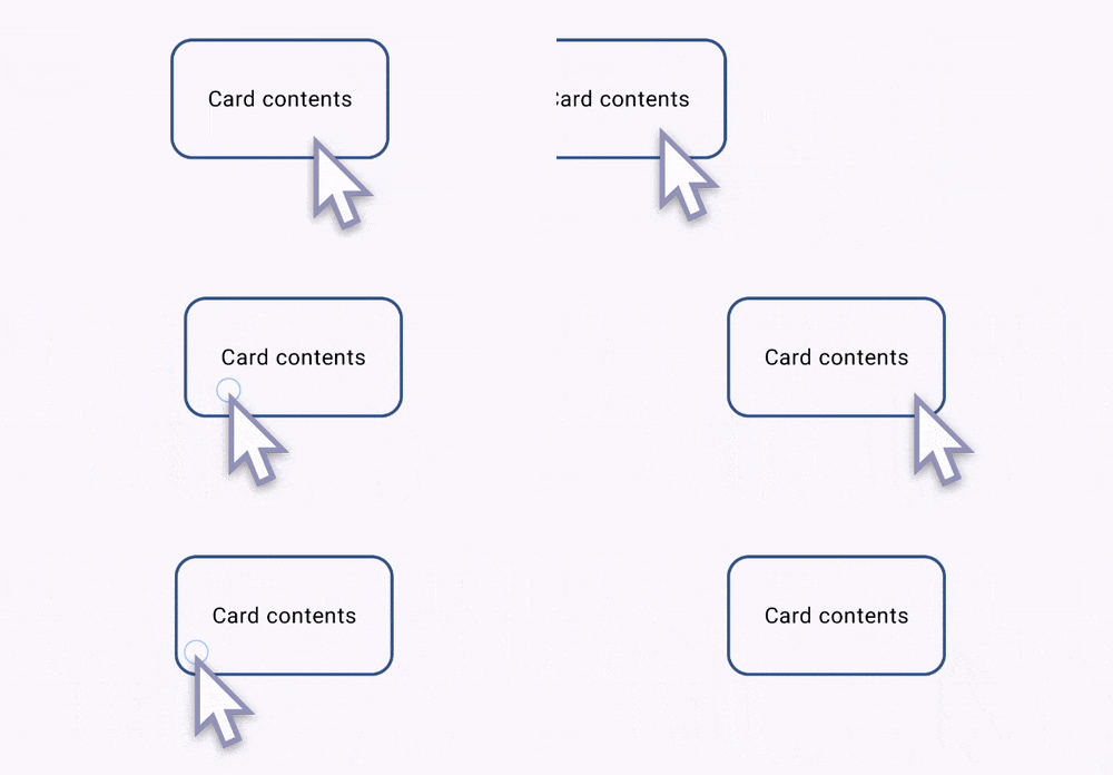
What we’re doing in the offset modifier is using the value provided by the AnchoredDraggableState we have initialized in the previous step. The anchoredDraggable takes care of everything else related to the gesture handling. So after you apply some basic styling to the Column above you end up with that result.

Great. We have swiping with snapping between 3 points. But this isn’t yet the complete swipe to dismiss. The current functionality is as far as we can get by using solely the AnchoredDraggable APIs. The following sections add more code to the example to achive the final swipe to dismiss.
But now, let’s actually create the dismiss effect
Starting with what we have, here is what we will add to achieve the final look and feel:
- When the Composable is being swiped towards LEFT or RIGHT, it will fade out
- We will hoist the visibility state of the whole component by having a boolean
showinput parameter as well as anonDismissRequestlambda callback. - We will show the Composable only when the
AnchoredDraggable’s current state is the CENTER state.
Adding fade out
With a bit of calculations, we can create a new derived state based on the AnchoredDraggable.offset value. Here is the code:
// Making the component fade out while swiping away toward maximum distance.
// Calculate alpha based on the absolute offset. The value is 1.0f when offset is 0.
// The closer the offset gets to the max swipe distance, the closer this value gets to 0f.
val alpha = remember {
    derivedStateOf {
        abs(abs(anchorState.offset) - swipeDistanceAndVelocityPx)
            .div(swipeDistanceAndVelocityPx)
    }
}

...

Column(
    modifier = Modifier
        // Remove that
        // .offset {
        //    IntOffset(anchorState.offset.roundToInt(), 0)
        // }
        .graphicsLayer {
            this.translationX = anchorState.offset
            this.alpha = alpha.value
        }
        .anchoredDraggable(
            state = anchorState,
            orientation = Orientation.Horizontal,
        )
) {
    ...
}
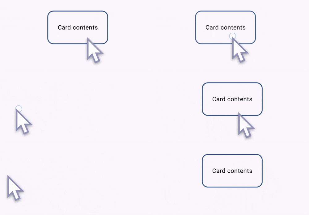
Above we have defined a new derivedStateOf for the alpha that changes between 1f and 0f based on the offset from the AnchoredDraggable. Notice also that we have replaced the offset modifier with the graphicsLayer, since we’re now changing 2 variables - X translation and alpha value. After doing those steps the results look like that:

Hoisting the visibility state
We will achive this by using 2 different LaunchedEffects. Let’s take a look at the first one:
LaunchedEffect(key1 = show) {
    when {
        show.not() && anchorState.currentValue == HorizontalSwipeAnchor.CENTER -> {
            anchorState.animateTo(
                targetValue = HorizontalSwipeAnchor.RIGHT,
            )
        }

        show && anchorState.currentValue != HorizontalSwipeAnchor.CENTER -> {
            anchorState.snapTo(HorizontalSwipeAnchor.CENTER)
        }
    }
}
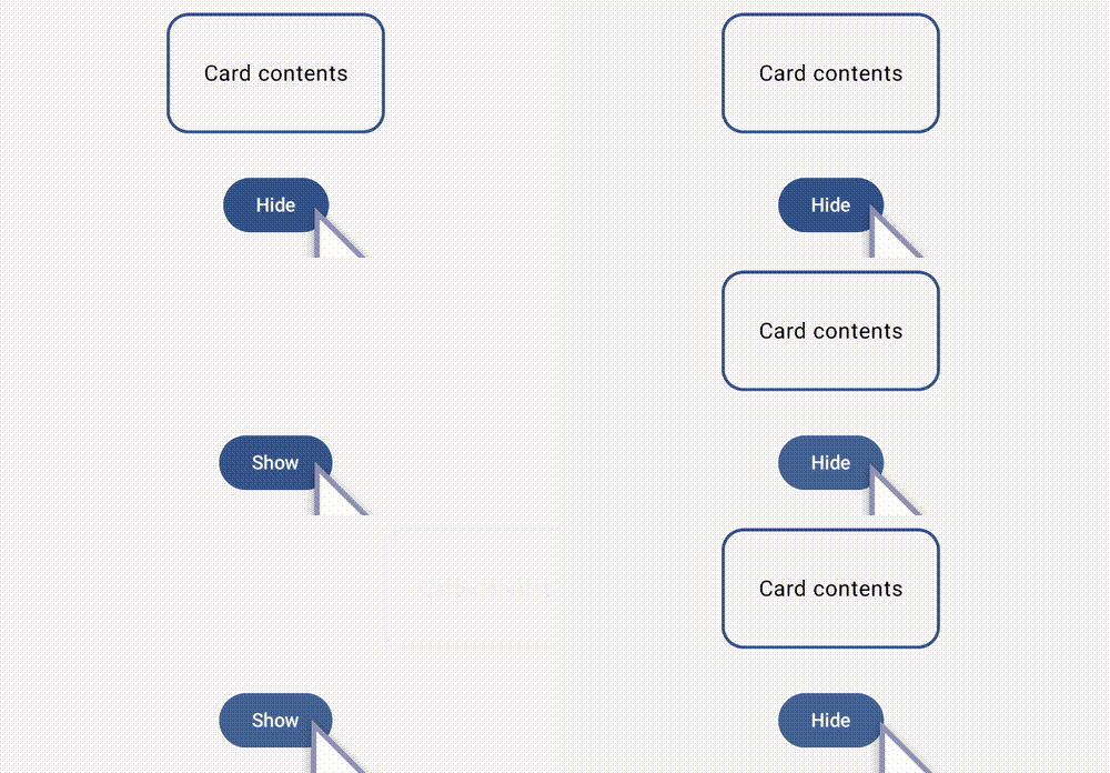
This launched effect uses the AnchoredDraggable methods to either instantly snap its offset to the CENTER value to, or animate it towards the RIGHT value. This achieves the following effect.

The second LaunchedEffect takes care of calling the onDismissRequest callback, whenever Composable is dismissed through the swipe gesture. It looks like that:
LaunchedEffect(key1 = anchorState.currentValue) {
    when (anchorState.currentValue) {
        HorizontalSwipeAnchor.LEFT, HorizontalSwipeAnchor.RIGHT -> {
            if (show) {
                onDismissRequest()
            }
        }

        HorizontalSwipeAnchor.CENTER -> {
            // Do nothing
        }
    }
}
The final step is to completely remove from the composition the Composable, when it is completely faded out. To achieve that we simply wrap it into a check for the AnchoredDraggable.currentValue to be equal to CENTER like this:
if (anchorState.currentValue == HorizontalSwipeAnchor.CENTER) {
    Column(
        modifier = Modifier
            ....
    )
}
And that’s it. We have achieved a simple swipe to dismiss functionality with horizontal transition and fade out effect. Now go wild and add more crazy styling and effect to it ;)
P.S. If you’ve reached that point, I want to thank you for reading all of that. Don’t forget to check the full code in the repo here: Swipe to dismiss

