
If you have been paying attention when installing new apps lately, you have definitely noticed the changes in the design of the pop-up dialog with permissions, which is presented to users in Google Play. Google design and user experience experts have worked together to come up with an improved version of this piece of UI. It is no longer a simple list of scary sounding names coupled with very technical and sometimes misleading short descriptions.
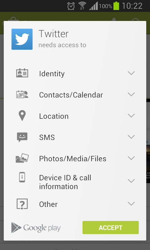
The new look consists of categories of permissions each including a graphical symbol and a non-technical description of what the application could actually do with them. These categories are also ordered by priority. For example, it is assumed that it is more important for users to be aware if an app can access their location than the fact it can make the device vibrate or that the app uses internet connection.
Some permissions are even considered to have so low priority, that they are not even shown. A good example is the internet permission - since the vast majority of apps need internet to provide a useful functionality, users are no longer explicitly asked for it. Instead the dialog states that the app does not require any special permissions.
Can I see the individual permissions at all?
But the changes are not just adding the categories and some icons - users do not see the individual permissions that go under each category, but just the category’s description. At first this may look like the new look misleads users to agree with more than they actually may want to agree. Before moving on discussing the good and bad sides of the new design, let me just mention that there is still a way to view the list with individual permissons. You have to simply scroll down a little bit on the apps’s page in Google Play and click on the View details under the Additional Information section.
The only difference here compared to the list we had before is that the new permission categories are also visible and the individual permissions are neatly grouped by their corresponding categories. What is important to notice is that the new permissions are also as before explicitly marked. I’m putting some focus on this, since this has also been changed in the new look of the pop-up dialog. More on this in the following sections.
Why the new look is good
I guess it is pretty clear why the new look is a significant improvement over the old list of permissions. Adding icons and simplifying the descriptions allows more users to actually understand the meaning of the terms they agree with. I have personally seen many users who could not understand a word of the prior highly technical descriptions, thus they had no real idea what they agree with. In addition grouping permissions in categories is a really nice way of putting some order into the otherwise completely shuffled list of individual permissions.
Hiding completely the individual permissions and keeping only the category is also a good thing. Of course, people have the right to know, but imagine the following situation. You build a messenger app and you integrate a nice way of sending around pictures. You add only the Camera permission to your app, cause you simply need to include the camera stream in you app and take pictures. At some point you develop an awesome new feature, which allows users to send around cool videos they take. Now, in order to have any sound in these videos, you need to add another permission for actually recording audio. When users see the new permission, the more paranoid ones might say that you want to spy on them and record what they say and do without their knowledge, when you simply need the audio for the videos they would eventually send around. I know it sound really funny, but there are many such users and media does not help a lot with statements such as “90% of mobile malware is for Android”. With the new look, you do not have the same problem, since both permissions are hidden under the same category, so people would not get scared of the newly coming permission and would simply enjoy the awesome new feature you have put so much work into.
In addition, some permissions are just simply too technical and nobody understands what they mean, even us developers. For example, why would be exactly useful to know that an app can “read phone status and identity” or that it can “test access to protected storage”? Seriously, Google Play is not like the wild wild west. Although apps do not go through the same thorough sanity check which iOS apps in the App Store go through, Google Play still eventually bans malicious apps and provides some protection against them. So it’s fine to hide some stuff to allow users to be less paranoid about what actually happens.
What is bad in the new look
Hiding individual permissions is bad. Sometimes apps require simply too much stuff for no obvious reason or for some extra feature which you’re not interested in. In that case hiding individual permissions or newly added ones tricks you to agree with more than you actually would. This is not really fair. There is, however, an even bigger FAIL. For some reason the pop-up dialog does not explicitly mark as new even whole categories, which I find really bad. I could understand not notifying for new individual permissions added to a category the users already agreed with, but not making clear that a whole new category has been added is just wrong.
Another drawback is that categories might sometimes be too broad. For example, some users might be unhappy with you accessing the microphone when you require access to the “Camera/Microphone” category although you only really use the Camera permission and you do not require the audio at all. The users would however not see this, but instead the whole category name, so deal with some negative feedback even when it is not deserved.
One can probably come up with many more reasons why the new look is bad, but I would stop here and point out that one can still see the full list with individual permissions through the button mentioned above. So brace yourselves, negative user feedback might be coming for you, and you better be ready to reply to them in a proper and polite manner.